On GIFs and Responsive Design in Dataviz
I started experimenting with the R package ggplot2 for the first time in August 2015, which turned out to be quite the gateway drug. A handful of GIF data animations posted to reddit turned out to be way more popular than I had anticipated.
While the general audience was mesmerized by “dancing jello blobs”, the use of GIFs and animation in data visualization have some significant downsides that I was previously ignorant to. A few AMAs with established figures in the dataviz community were extremely helpful in pointing me to relevant readings and ideas that improved my understanding of what battles are actually being fought when one creates an abstract visual representation of data.
Randal Olson wrote an excellent blog post comparing animated GIFs to small multiples using the same fertility data in response that ultimately persuaded me to forgo sweet karma and join the fight against GIF files.
Although Stephen’s GIF is fun to watch — especially because the animation gives the appearance of waves rising and falling — I couldn’t help but be frustrated by the limitations of GIFs in data visualization. If we wanted to compare the fertility rates of 1980 and 2010, for example, we’d have to keep a mental snapshot of what the 1980 frame looked like for when the 2010 frame came around. Thus, comparisons of time points beyond a couple years are impossible with animated GIFs unless the viewer has photographic memory.
–Randal Olson
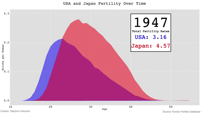
He is spot on, and forget trying to compare two years for now. It was frustrating for me, the creator of the visualization to look at one specific year! How can someone not as familiar with the data be expected to gain useful information?
Responsive Design in Data Visualization
The damning quality of the GIF is lack of control, but I have not been as quick to abandon interactive animation which has some support in the literature (thanks Tamara Munzner for referring me to Tversky and Morrison 2002 in that AMA). GIFs and animation were referred to as sort of the same thing in Olson’s article and I want to fully unwrap them here.
What I valued about GIFs is that they are relatively easy to create and behave basically the same no matter what device is viewing them. Olson’s point that small multiples are incredibly useful is true, but their utility is also minimized on the growing share of small devices used to access the internet. Even for a data literate audience not easily lulled by the charms of an animation, looking at 1-year or even 5-year small multiples of some of the fertility data on a 4-inch screen is nightmarish.
Responsive design has already been promoted from buzzword to core tenet among web developers. The optimal path forward for viz folk should be to think about visualization designs that adapt to audience and device just as much as we think about selecting charts appropriate for the data being visualized. This is not a revolutionary idea and it is practiced by most major news organizations and quite a few individuals, but there are many stragglers across blogs, governments, and other entities that treat mobile as an afterthought.
Part of the reason is time. Testing the first batch of responsive/interactive/animated Charts On Charts visualizations across computers, tablets, and phones in a variety of configurations has been just as much a test on my sanity. Transitioning away from GIFs but keeping animation meant learning some HTML, CSS, and JavaScript in addition to navigating Amazon Web Services and the Jekyll static site generator.
Not everyone can handle all of that depending on what other obligations they have just to make and share data visualizations. There is still something to be said for the simplicity of uploading a GIF to imgur or a small multiples PNG that users just have to pinch-zoom. Taking down the barriers to creating adaptive visualizations means publishing more code examples, tutorials, and open source tools that decrease development time.
Age-Specific Fertility Rates v2.0
The biggest advantage with moving to JavaScript away from GIFs and PNGs is that there is now access to all other countries in the Human Fertility Database in one place, encouraging people to ask questions and explore the data. Hopefully this leads to higher engagement, gets people to stick around longer, and results in better overall comprehension. In addition, all the dimensions of the chart adapt to the number of pixels available on the device it is viewed on.
The pencil-paper first draft of the revised visualization presented small multiples for computers and tablets while giving the animation to phones based on media queries. There would be toggle buttons that modify the chart to cycle through the animation mode, a two year comparison mode that included sliders but no play button, and a small multiples mode that displayed every year.
Anything more than about a 6 frame small multiples chart personally made me a little dizzy with the fertility data. Some important (but small) fluctuations I want to highlight can be difficult to compare across physical space, but easy to see in the animation. In this particular case, I am still in favor of animation.
The current version of this visualization defaults to the animation and includes a link to open small multiples in another window. I need to improve my understanding of JavaScript scope and iframe styling to get it more elegant, but I think this does a good job of satisfying a wide variety of audiences for now and improves the overall utility without making the controls too complex.
Moving Forward
My views are still being refined as I look into how engagement and comprehension interact with presentation styles, but I hope this contributes to the discussion in a positive way. Ultimately the next step I would look into is designing an A/B test for use in the wild after completing a more thorough literature review (static small multiples versus animation, and then when interactivity is mixed in). I have not yet come across a completely satisfying public study constructed in this way. Engagement and comprehension in the lab is one thing, but what happens when you are not literally paying your audience for their attention?
If an interactive animation is fun enough that someone sticks around to read a long article about fertility rates of all things, my hypothesis is that comprehension of the topic will be higher than if they were to move on to the next piece of clickbait. This statement might be too bold for a newcomer to the field still wading through existing literature, but even if animation happens to be inferior to small multiples in isolation, charts are of course just one supplementary communication tool among many. They do not possess some sacred quality that commands practitioners to minimize enjoyment for the sake of marginal improvement in comprehension that might only exist in a controlled environment (especially when the alternative presentations are available with a click).
It is my current view that charts are fundamentally a multi-use tool that can be used to sell the value of “boring” topics to people while simultaneously educating them. The last few years of my life also provide anecdotal evidence that an animated chart can be captivating enough to push someone to pursue advanced degrees in a field and make life altering decisions to contribute in some way.
I teach global health, and I know having the data is not enough. I have to show it in ways people both enjoy and understand.
–Hans Rosling
To be explicit though, efforts to purposely mislead and gross negligence should obviously be strongly condemned. I am also sensitive to the possibility that in some cases people walk away from charts and articles with a false confidence in how informed they actually are, which is a problem for a future post and not limited to dataviz.
The full fertility rate trend post is live and you can explore the ASFR viz code here . Let me know if you have thoughts on using animated charts effectively or if you think they belong in a dumpster with 3d pie charts! I promise to keep an open mind.