The R code below can replicate this chart. You can get help installing R here.
You can get help with the tidycensus data retreival package here.
You can get help with the gganimate package here.
# Load R packages
library(tidycensus)
library(tidyverse)
library(gganimate)
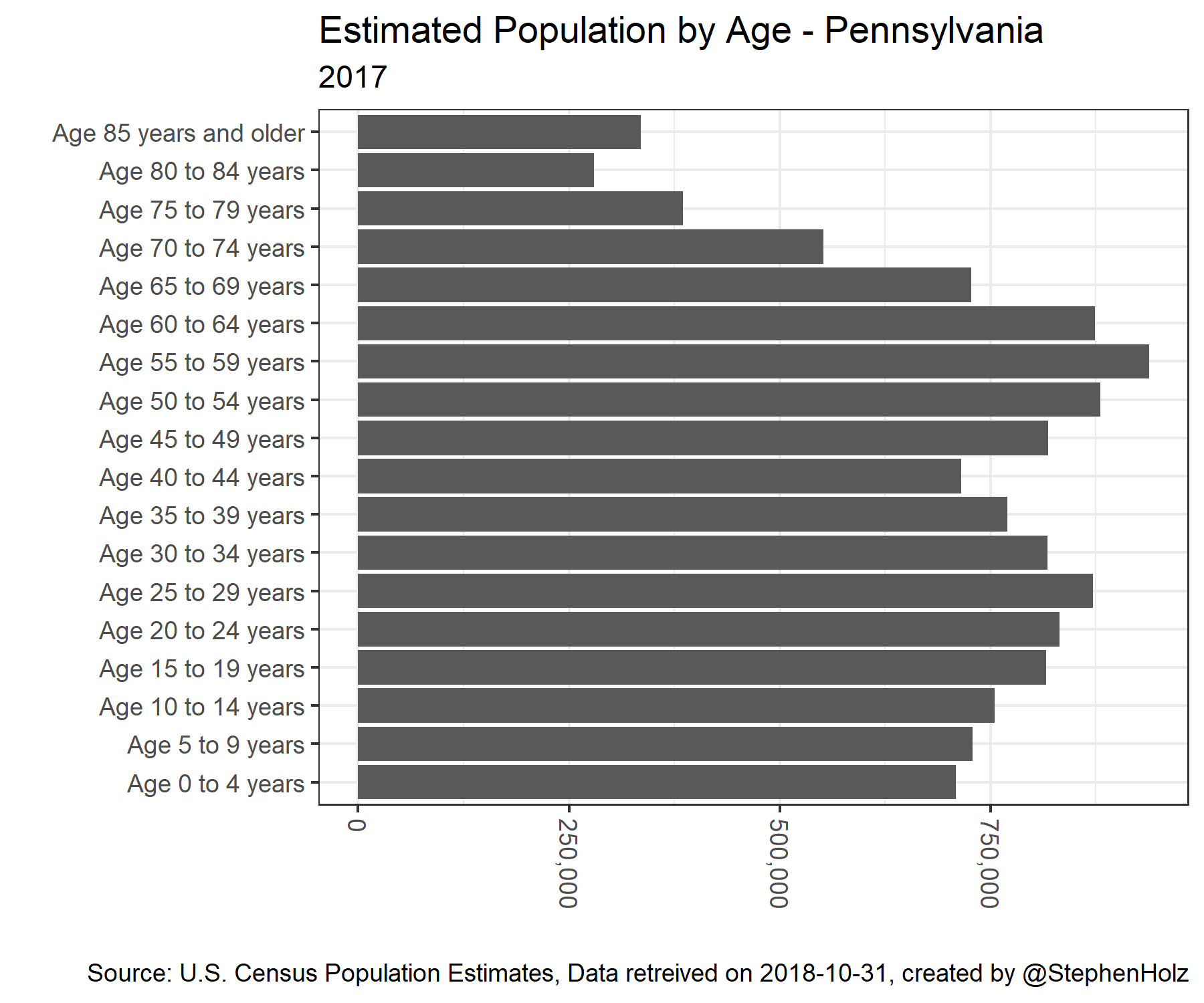
# Get Data
population <- get_estimates(geography = 'state',
product = 'characteristics',
breakdown = c('SEX', 'AGEGROUP', 'HISP', 'RACE'),
state = 'PA',
breakdown_labels = TRUE,
time_series = TRUE)
# Wrangle Data
population %>%
filter(
SEX == 'Both sexes',
str_detect(AGEGROUP, '^Age'),
HISP == 'Both Hispanic Origins',
RACE == 'All races',
DATE == 10
) %>%
ggplot() + # Visualize Data
geom_bar(aes(x = AGEGROUP, y = value), stat = 'identity') +
scale_y_continuous(labels = scales::comma) +
coord_flip() +
theme_bw() +
theme(axis.text.x = element_text(angle = -90, hjust = 0, vjust = .5)) +
labs(
title = 'Estimated Population by Age - Pennsylvania',
subtitle = year_label,
y = '',
x = '',
caption = paste0('Source: U.S. Census Population Estimates, Data retreived on ', Sys.Date(), ', created by @StephenHolz')
)